Static mode
Configuration setting
mode: 'static'
Description
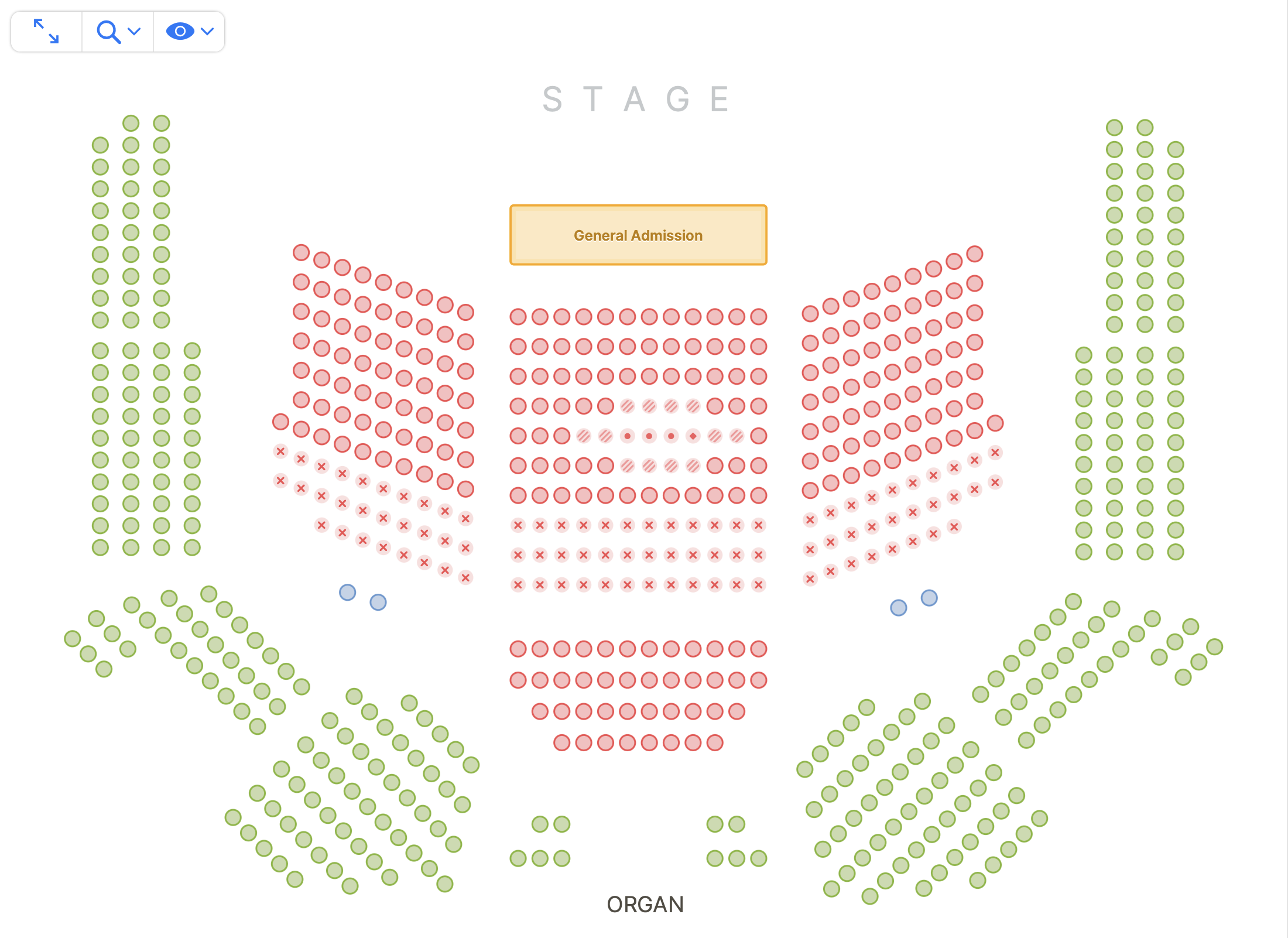
In static mode, objects cannot be selected. It is very similar to the static mode on the Renderer, but with the information and permissions only available in Event Manager modes.
It is meant as a way to provide your back office users means to get a view on the current state of the Event.
Configuration
Takes all of the Event Manager configuration options, styling and callbacks.
This mode also takes the following options:
events
events: string[]
The keys of the events for which you want to render the event manager.
onObjectMouseOver: (mousedOverObject) =>
Fired when the cursor enters an object (seat, table, etc).
onObjectMouseOut: (mousedOutObject) =>
Fired when the cursor leaves an object (seat, table, etc).
setHighlightedObjects: (objectLabels) =>
Highlights the specified objects (and dims all others) for easier visual identification.
If you are using onObjectMouseOver and onObjectMouseOut to trigger highlighted objects, we recommend passing an empty array on mouse out to avoid excessive flashing while moving the cursor between objects. See the following example for the difference in behavior:
Note: Passing an empty array will dim all objects.
clearHighlightedObjects: () =>
Clears all objects highlighted by setHighlightedObjects and reverts them to default appearance.
objectPopover
Type: object
Default:
{
    showOrderId: true,
    showTechnicalLabel: false,
    showLabel: true,
    showCategory: true,
    showChannel: true
}
Allows to toggle on or off some features from the Object Popover, displayed when hovering objects when using pointing devices like a mouse, or when tapping on an object on touch devices.
The popover can also display prompts when needed such as those to confirm selection, select number of places, ticket types, or both.
showOrderId: - Default: true. If true, the orderId will be shown as long it's present.
showTechnicalLabel: - Default: false. If true, the technical label will be shown, as long one of the label components was overridden via the Displayed Label field in Designer.
showCategory: - Default: true. If true, the object's category color and name will be displayed as long the object is available.showChannel: - Default: true. If true, the object's channel will be displayed.showLabel: - Default: true. If true, the section label, row label and/or seat label of the object will be visible. If false, no labeling will be shown.
tooltipContents: (object) => string
A function to replace the contents of the object popover with custom text. The object parameter is the currently hovered object.
Can be formatted using the following subset of BBCode tags:
[b]bold[/b]- Applies a bold styling.[i]italic[/i]- Applies an italic styling.[pre]preformatted[/pre]- Applies an fixed-width styling with pre white spacing.[br/]- Inserts a break line.
objectIcon
Callback used to override the icon displayed by an object. For implementation details see the objectIcon renderer setting.