Select mode
Configuration setting
mode: 'select'
Description
Allows to select objects similarly like on the Renderer, but with the information and permissions only available in Event Manager modes. It is meant as a way to provide your back office users means to select seats to perform custom operations.
You will need to pass in callbacks to make use of this mode, such as onObjectSelected and onObjectDeselected.
Retrieving the selected objects
You can retrieve the selected objects from Event Manager in select mode in the same ways as you would on a normally rendered chart:
chart.selectedObjectscontains the array of selected object labelsonObjectSelectedandonObjectDeselectedare fired when the selection changeschart.listSelectedObjects()can be used to get more data about the current selection, other than the object labels.
Configuration
Takes all of the Event Manager configuration options, styling and callbacks.
This mode also takes the following options:
maxSelectedObjects
Limits the number of objects the user can select. Can be configured in more detail by ticket type and category. For the full list of options, see maxSelectedObjects renderer setting.
numberOfPlacesToSelect
Activates one-click selection mode. For details, see numberOfPlacesToSelect renderer setting.
selectedObjects
Pre-selects a number of objects.
selectedObjects: ['A-1', 'A-2']
It's also possible to pass in ticket types:
selectedObjects: [{label: 'A-1', ticketType: 'adult'}, {label: 'A-2', ticketType: 'child'}]
For general admission areas, you need to specify not only the object label, but also the amount, like so:
selectedObjects: [{label: 'MyGA', amount: 4}]
Note that you can mix and match the two, so this will select both the seats and the GA as expected:
selectedObjects: ['A-1', 'A-2', {label: 'MyGA', amount: 4}]
selectionBy
selectionBy: string
Defines what the user selects when clicking on an object.
Possible values are:
'places': Default. Selection is done in the context of places. Areas, which contain many places, will either have all places selected or prompt the user to specify how many places to select depending on the type of Area.'objects': Selection is done in the context of objects. Selecting an Area selects the object itself, not the places inside, and will not prompt the user to choose places either. Only triggers oneonObjectSelectedevent.
events
events: string[]
The keys of the events for which you want to render the event manager.
ticketTypes
ticketTypes: object[]

// an example
ticketTypes: [
    {'category': 1, 'ticketTypes': [
        {'ticketType': 'adult', 'label': 'For adults', 'description': 'Includes hot meal and a drink'},
        {'ticketType': 'child', 'label': 'For children', 'description': 'Includes burger and fries'}
      ]
    },
    {'category': 2, 'ticketTypes': [
        {'ticketType': 'adult', 'label': 'For adults', 'description': 'Includes hot meal and a drink'},
        {'ticketType': 'child', 'label': 'For children', 'description': 'Includes burger and fries'}
      ]
    }
]
The list of ticketTypes per category. Passing in this property will allow you to select a ticket type after selecting an object,
just like what the pricing configuration option does for Renderer.
Formally, ticketTypes look a lot like pricing, except that you cannot pass in price or originalPrice.
ticketType, label and description are supported.
objectPopover
Type: object
Default:
{
    showOrderId: true,
    showTechnicalLabel: false,
    showLabel: true,
    showCategory: true,
    showChannel: true
}
Allows to toggle on or off some features from the Object Popover, displayed when hovering objects when using pointing devices like a mouse, or when tapping on an object on touch devices.
The popover can also display prompts when needed such as those to confirm selection, select number of places, ticket types, or both.
showOrderId: - Default: true. If true, the orderId will be shown as long it's present.
showTechnicalLabel: - Default: false. If true, the technical label will be shown, as long one of the label components was overridden via the Displayed Label field in Designer.
showCategory: - Default: true. If true, the object's category color and name will be displayed as long the object is available.showChannel: - Default: true. If true, the object's channel will be displayed.showLabel: - Default: true. If true, the section label, row label and/or seat label of the object will be visible. If false, no labeling will be shown.
tooltipContents
tooltipContents: (object) => string
A function to replace the contents of the object popover with custom text. The object parameter is the currently hovered object.
Can be formatted using the following subset of BBCode tags:
[b]bold[/b]- Applies a bold styling.[i]italic[/i]- Applies an italic styling.[pre]preformatted[/pre]- Applies an fixed-width styling with pre white spacing.[br/]- Inserts a break line.
isObjectSelectable
isObjectSelectable: (object, defaultValue, extraConfig) => boolean
A function that controls whether an object can be selected or not. The function is called for every object in the chart, and the object parameter is the object currently being evaluated. A return value of true enables selection and false disables it.
This function takes precedence over other selection properties, such as selectableObjects and unavailableObjectsSelectable.
unavailableObjectsSelectable
unavailableObjectsSelectable: boolean
Controls whether unavailable objects can be selected or not. Set to false to only allow selecting available objects.
unavailableObjectsSelectable is true by default.
selectableObjects
selectableObjects: ['A-1', 'A-2']
Makes the specified objects selectable.
This allows you to make objects selectable, even if they would normally not be selectable.
For instance, you could be passing in unavailableObjectSelectable: false and still make some booked seats selectable.
This is useful when you are using Select Mode to build a screen allowing a backoffice user to swap seats for ticket buyers. In that case, you could do something like this:
{
	unavailableObjectsSelectable: false, // selection should be limited to available seats
	selectableObjects: ['A-6', 'A-7'], // additionally, the currently booked seats on the order should be selectable
	selectedObjects: ['A-6', 'A-7'], // The currently booked seats on the order should be selected
	maxSelectedObjects: 2 // prevent selecting more than the number of seats on the order
}
objectIcon
Callback used to override the icon displayed by an object. For implementation details see the objectIcon renderer setting.
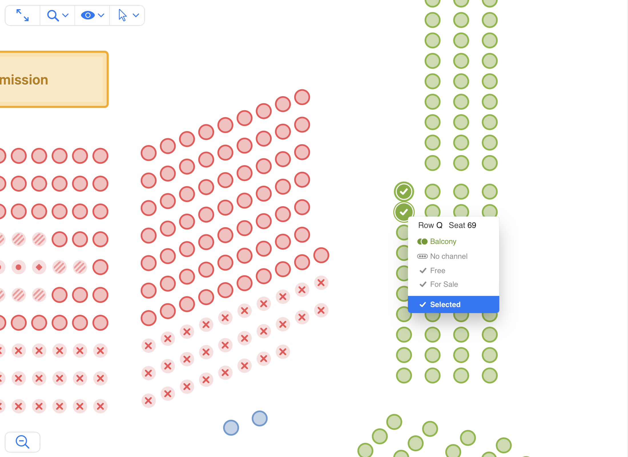
Additional methods for this mode
chart.setHighlightedObjects
chart.setHighlightedObjects(objectLabels: string[])
Highlights the specified objects (and dims all others) for easier visual identification.
Note: Passing an empty array will dim all objects.
clearHighlightedObjects
chart.clearHighlightedObjects()
Clears all objects highlighted by setHighlightedObjects and reverts them to default appearance.
Additional callbacks for this mode
onObjectMouseOver
{
	onObjectMouseOver: (object) => {}
}
Fired when the cursor enters an object (seat, table, etc).
onObjectMouseOut
{
	onObjectMouseOut: (object) => {}
}
Fired when the cursor leaves an object (seat, table, etc).
Using mouse over to highlight certain objects
If you are using onObjectMouseOver and onObjectMouseOut to highlight certain objects, you may pass an empty array on mouse out to avoid excessive flashing while moving the cursor between objects, and optionally use clearHighlightedObjects after a few seconds of inactivity to restore the view.
See below the the difference between using setHighlightedObjects([]) and clearHighlightedObjects() on mouse out: