colors
Type: object
Replaces certain colors of the current color scheme. Allows HEX, RBG and HSL formats as defined in CSS.
Currently you can redefine:
colorSelected- The color used for certain interactive, selected or highlighted user interface elements (e.g. buttons).colorTitle- The color of certain tiles, such as in modal dialogs or the Category Filter.availableObjectColor- If passed, it will make all available objects use this as the primary color, regardless of their category. Affects the popover as well.selectedObjectColor- If passed, it will make all selected objects use this as the primary color, regardless of their category. Affects the popover as well.errorColor- The color used for an invalid seat due to validation settings, and the background color used for error messages in the popover.
Accessibility notice
Blue shades are the standard for links and action buttons. They have the unique properties of being easy on the eyes and colorblind safe - less prone to be confused with other colors. Bear this in mind when using other colors that might have less contrast with the background or might be uncomfortable to a percentage of your user base.
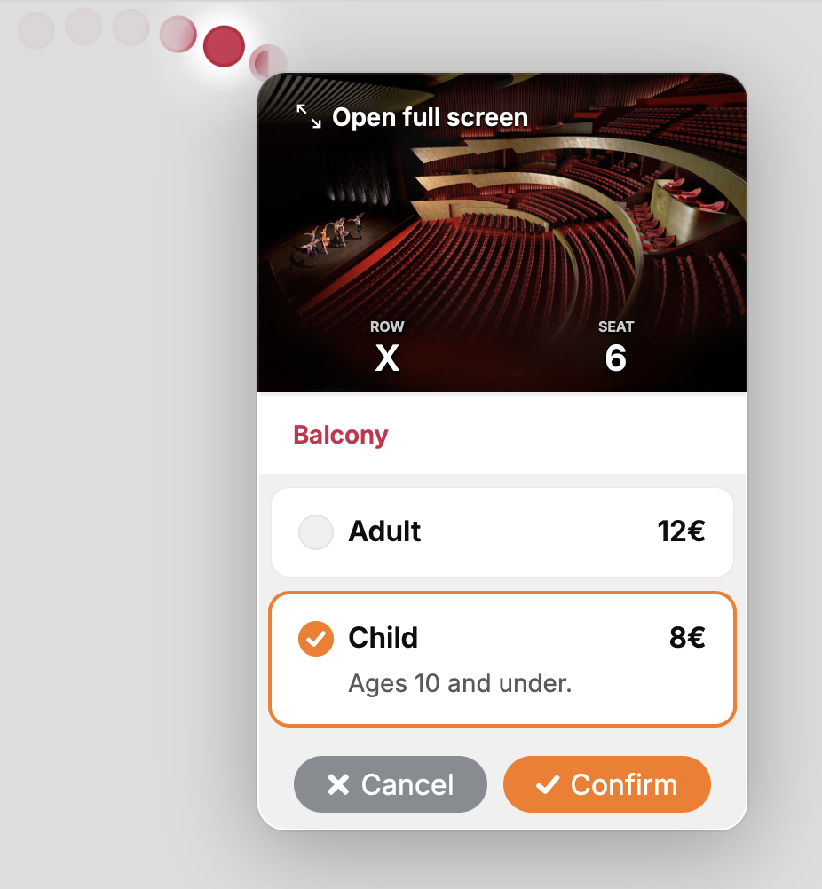
UI selected color example
Example:
colors: {
   colorSelected: 'hsl(26, 96%, 53%)'
}
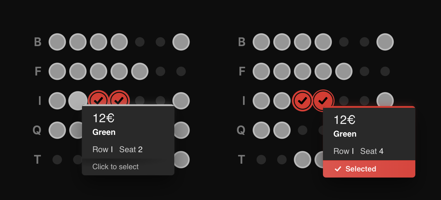
Object color example
colors: {
   availableObjectColor: '#BBBBBB',
   selectedObjectColor: '#E52827'
}